
CSS Box Shadow Generator
Interactively design single CSS box shadows and get the code.
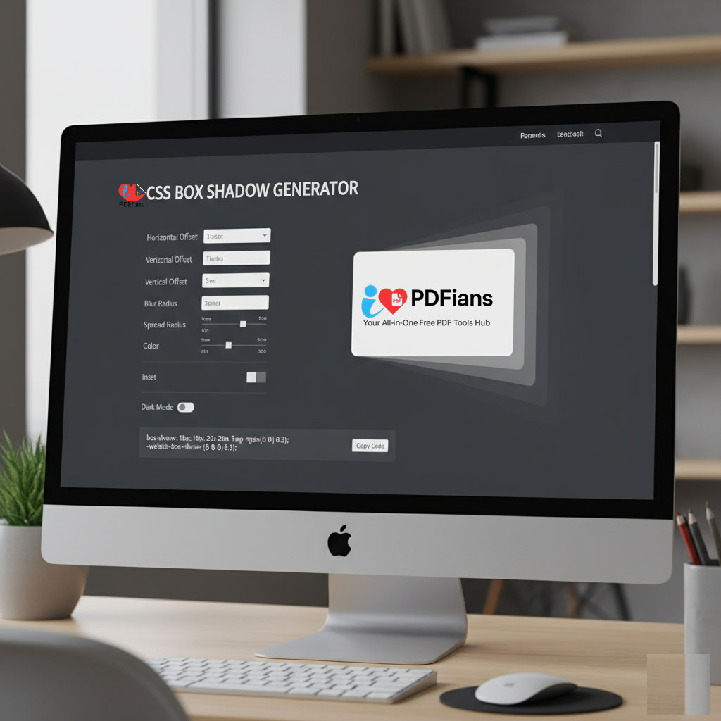
Shadow Properties
CSS Box Shadow Generator
In the world of modern web design, creating depth and dimension is key to making a user interface feel intuitive and visually appealing. One of the most powerful properties in a designer’s toolkit for achieving this is the CSS box-shadow. However, manually writing the code for complex, layered, or subtle shadows can be a tedious and time-consuming process of trial and error. To solve this, our interactive CSS Box Shadow Generator provides a seamless, visual interface to craft the perfect shadow effect effortlessly.
This tool is designed for front-end developers, UI/UX designers, and hobbyists alike. In fact, it empowers you to experiment with every parameter of the box-shadow property, from color and blur to offset and spread, all while seeing a live preview of your creation. Consequently, you can achieve sophisticated design effects in a fraction of the time. Ultimately, this generator isn’t just a code snippet provider; it’s a creative canvas for enhancing your web designs.
What Exactly is the CSS box-shadow Property?
The CSS box-shadow property is a standard used to add shadow effects around an element’s frame. Unlike older, image-based techniques, CSS shadows are lightweight, scalable, and highly customizable. With a simple line of CSS, you can add depth, create a “lifting” effect on hover, or design trendy styles like neumorphism.
Our CSS Box Shadow Generator demystifies the property’s syntax by providing intuitive sliders and color pickers for each value. As a result, you can immediately see the impact of each adjustment on the live preview element. This hands-on approach is perfect for both beginners learning the property and experts who need to generate complex styles quickly.
Breaking Down the Box-Shadow Syntax
The box-shadow property can accept several values, which together define the appearance of the shadow. Our generator gives you control over all of them:
-
Horizontal Offset (offset-x): This value determines the shadow’s horizontal position. A positive value pushes the shadow to the right, while a negative value moves it to the left.
-
Vertical Offset (offset-y): Similarly, this controls the vertical position. A positive value moves the shadow down, and a negative value moves it up.
-
Blur Radius: This is where the magic happens. A larger value creates a more blurred, softer shadow, making it look more spread out and natural. A value of 0 results in a sharp, unblurred shadow.
-
Spread Radius: This value controls the size of the shadow. Positive values cause the shadow to expand and grow larger in all directions, while negative values cause it to shrink.
-
Color: You can define the shadow’s color using any valid CSS color format, such as HEX, RGB, or RGBA. Using RGBA is highly recommended for shadows, as the alpha channel allows you to control transparency for more subtle effects.
-
Inset (Optional): This keyword changes the shadow from an outer drop shadow to an inner one, making the element appear depressed or sunken into the page.
The Power of Layering with a CSS Shadow Generator
One of the most powerful features of box-shadow is the ability to apply multiple shadows to a single element. By separating each shadow’s definition with a comma, you can create incredibly rich and realistic depth effects. For instance, you could use a small, dark, and tight shadow combined with a larger, lighter, and more diffuse one. Manually coding this can be confusing, which is why a visual CSS Box Shadow Generator is so valuable. Our tool includes functionality to add, edit, and reorder multiple shadow layers, giving you complete creative control.
How to Use Our Visual CSS Box Shadow Generator
We designed our generator to be as intuitive as possible. The goal is to let you focus on the creative aspect of shadow design without getting bogged down in the syntax. The instant visual feedback loop makes experimentation fast and fun.
Simply adjust the controls, and the tool will automatically generate the corresponding CSS code for you in real-time. This code is clean, standards-compliant, and ready to be copied directly into your stylesheet.
Step-by-Step: Crafting Your Perfect CSS Shadow
-
Adjust the Offsets: Use the “Horizontal Offset” and “Vertical Offset” sliders to position your shadow relative to the element.
-
Define Blur and Spread: Control the softness and size of the shadow with the “Blur Radius” and “Spread Radius” sliders. Watch the live preview to see how these values interact.
-
Choose a Color: Click the color picker to select a shadow color. We highly recommend using the RGBA tab to add transparency for a more professional look.
-
Add More Layers (Optional): If you want to create a more complex effect, click the “Add Layer” button. You can then configure this new shadow independently.
-
Toggle Inset: Check the “Inset” box if you want to create an inner shadow instead of the default outer drop shadow.
For an even deeper dive into the box-shadow property and its capabilities, the MDN Web Docs is an excellent and comprehensive resource.
Why a Generator is an Essential Web Design Tool
In a fast-paced development environment, efficiency is paramount. A CSS Box Shadow Generator is more than just a convenience; it’s a productivity tool that streamlines the design process and encourages creativity.
Firstly, it dramatically reduces development time. Instead of tweaking values in a code editor and constantly refreshing the browser, you can finalize the perfect shadow in seconds. Secondly, it lowers the barrier to entry for creating advanced CSS effects. Designers who may not be CSS experts can still produce high-quality, developer-ready code without writing a single line by hand.
Fostering Creativity and Experimentation
When the process is visual and immediate, you’re more likely to experiment. You can quickly test different layering combinations, colors, and opacities to discover unique styles that you might not have thought to code manually. This freedom to explore is invaluable for pushing your design skills forward. In addition to styling elements, it’s also crucial to ensure the content within them is valid, which is where a tool like our HTML Entities Encoder/Decoder becomes useful.
Frequently Asked Questions (Q&A)
Here are answers to some common questions about our CSS Box Shadow Generator and the property itself.
Can I create multiple shadows on one element with this tool?
Yes, absolutely! Our generator is built with layering in mind. You can add, configure, and manage multiple shadow layers to create rich, composite shadow effects. The tool will generate a single, clean box-shadow property with the comma-separated values for all your layers.
Does box-shadow affect the element’s size or layout?
No, the box-shadow property does not alter the dimensions of the element or affect the page layout in any way. It is drawn “outside” the element’s box (unless inset is used) and does not take up any space in the document flow. This makes it a safe property to use without worrying about unintentionally shifting other elements.
Is it better to use rgba or hex for shadow colors?
For shadows, rgba is almost always the better choice. The ‘a’ in rgba stands for alpha, which controls transparency. Real-world shadows are not solid blocks of color; they are semi-transparent. Using a low alpha value (e.g., rgba(0, 0, 0, 0.15)) will create a much more natural and subtle shadow that blends better with the background.
How does the inset keyword work?
By default, box-shadow creates a drop shadow that appears behind the element. When you add the inset keyword, the shadow is drawn inside the element’s border instead. This makes the element look like it is pressed or carved into the page. It’s a great technique for creating interactive button styles or neumorphic designs.